
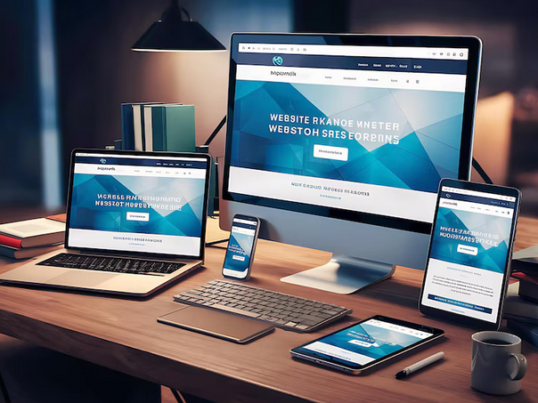
Responsive Web Design
In today's digital landscape, having a responsive website is crucial to providing an optimal user experience across all devices. Our Responsive Web Design service ensures that your website looks stunning and functions perfectly, whether viewed on a desktop, tablet, or smartphone. Here's what our comprehensive Responsive Web Design service includes:
Device Agnostic Design
We create websites that adapt seamlessly to any device or screen size. From large desktop monitors to the smallest smartphone screens, your site will look and perform beautifully, providing a consistent user experience for all visitors.
Fluid Grid Layouts
Our responsive designs use fluid grid layouts that automatically adjust to fit the screen size. This approach ensures that all elements on your website, from images to text blocks, are proportionately resized and positioned for optimal viewing.
Flexible Images and Media
We ensure that all images and media on your website are flexible and scalable. This prevents distortion or pixelation when viewed on different devices, maintaining visual quality and consistency.
Mobile-First Approach
We adopt a mobile-first design approach, ensuring that your website is optimized for mobile users from the ground up. This approach prioritizes the mobile user experience, which is essential given the increasing number of users accessing the web via smartphones and tablets.
Get Started Today
Ready to transform your business with a professional website? Contact us today to discuss your project and get a free quote. Let's build something amazing together.